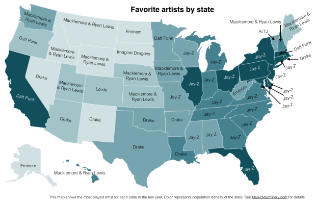
In my recent regional listening preferences post I published a map that showed the distinctive artists by state. The map was rather popular, but unfortunately was a source of confusion for some who thought that the map was showing the favorite artist by state. A few folks have asked what the map of favorite artists per state would look like and how it would compare to the distinctive map. Here are the two maps for comparison.
Favorite Artists by State
This map shows the most played artist in each state over the last year. It is interesting to see the regional differences in favorite artists and how just a handful of artists dominates the listening of wide areas of the country.
Most Distinctive Artists by State
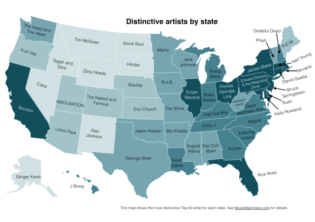
This is the previously published map that shows the artists that are listened to proportionally more frequently in a particular state than they are in all of the United States.
The data for both maps is drawn from an aggregation of data across a wide range of music services powered by The Echo Nest and is based on the listening behavior of a quarter million online music listeners.
It is interesting to see that even when we consider just the most popular artists, we can see regionalisms in listening preferences. I’ve highlighted the regions with color on this version of the map:
Favorite Artist Regions


